
MOBILE WEBSITE DESIGN
Make your website
easy to use on a phone.
Customers should be able to read, navigate, and contact you comfortably on a small screen, with the same useful information they expect on a computer.
Responsive design adapts the layout while keeping important tasks within easy reach.
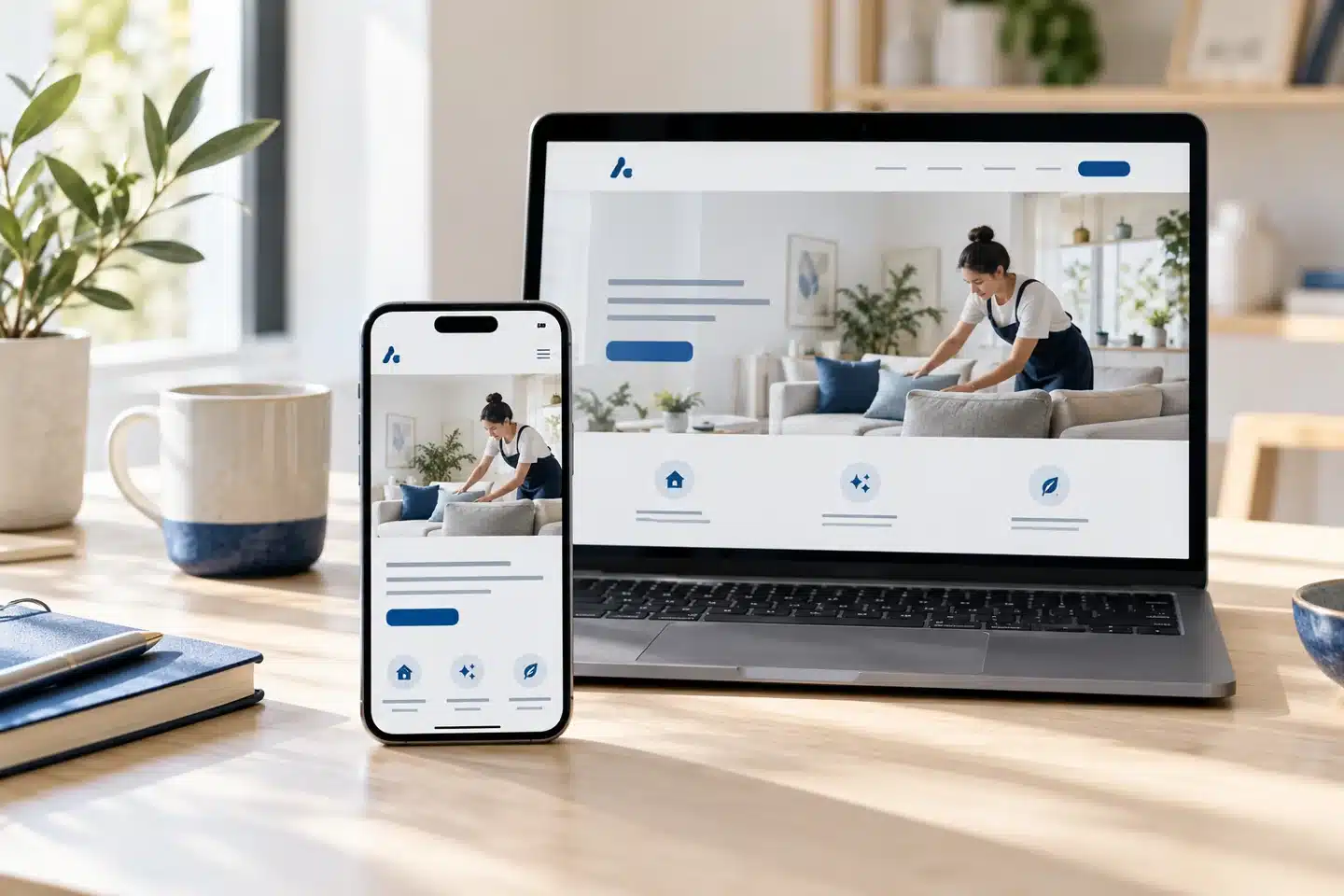
One useful website, adapted to the screen in front of your customer.
ReadableComfortable text and spacing.
UsableClear menus, links, and forms.
EfficientImages and features with a purpose.
PRACTICAL WEBSITE GUIDANCE
A better experience
on smaller screens.
Mobile design involves more than shrinking a desktop page. Review the tasks people actually need to complete.
Clear page priorities
Put the main message and useful next step near the beginning. Keep supporting information organized below.
Comfortable reading
Use readable text sizes, sensible line lengths, and enough space between sections. Allow visitors to zoom when needed.
Usable navigation
Make menu controls clear and easy to operate. Keep labels descriptive and ensure important pages are reachable.
Simple contact options
Use clear phone and contact links. Keep forms focused and make labels, feedback, and required fields easy to understand.
Flexible media
Size images for their intended use and let them adapt to the available space. Check that crops preserve the important subject.
Practical testing
Review phones, tablets, landscape orientation, keyboard access, and zoom. Look for clipped content and unwanted horizontal scrolling.
THE CUSTOMER’S TASK
Small screen.
Complete experience.
A visitor may need a quick phone number, a service explanation, or enough detail to compare options. Keep the content useful while making it easier to scan and act.
Speed and usability work together. Large images, distracting effects, and unnecessary features can get in the way of a simple task.
TRY THREE EVERYDAY TASKS
Find a service
Can you locate and understand it quickly?
Read the details
Does the page remain comfortable to use?
Make contact
Can you complete the next step easily?

Good mobile design supports real people in everyday situations.
PUT IT INTO PRACTICE
Review the journey.
Fix the friction.
1. Start with key pages
Check the homepage, important services, and Contact page on a phone.
2. Try the real actions
Open the menu, follow links, and test the forms without relying only on appearance.
3. Check different conditions
Review smaller widths, larger text, and slower connections, then prioritize the issues that block people.
EXPLORE RELATED GUIDES
Keep building
your website knowledge.
Explore these connected topics for practical next steps.
RELATED RESOURCE
Web Design Choices
Layout, color, photography, and content should work together to make the experience clear.
RELATED RESOURCE
Call To Action
Clear wording, useful placement, and a straightforward process help turn interest into action.
RELATED RESOURCE
Updating Your Web
Some websites need a few focused updates. Others benefit from a more complete redesign.
YOUR NEXT STEP
Is your website comfortable
to use on a phone?
Talk with Eileen Forte about your website, your priorities, and a practical next step for your business.