
Typography shapes how easily a visitor can read and understand a website. The font family matters, but so do size, weight, spacing, line length, and the way text behaves on a small screen. A useful type system works with ordinary content, not just a short headline in a mockup.
Make these eight decisions before adding decorative effects.
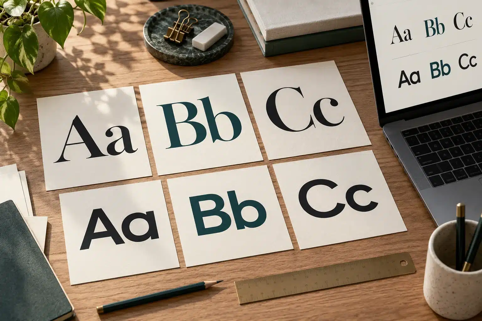
1. Choose a dependable reading font
Test the font in full paragraphs with numbers, punctuation, and mixed-case words. Look for distinguishable letterforms and comfortable spacing. A display font that suits a logo may be tiring in a long service description.
2. Keep the family and weight choices manageable
Start with a small set of purposeful roles, such as body text, headings, and emphasis. Extra families and weights can create inconsistency and additional downloads. Check the font's license and use an appropriate website delivery method.
3. Establish a meaningful heading hierarchy
Use headings to identify sections, not merely to enlarge text. Let appearance reinforce the content structure. A visitor should be able to scan the headings and understand the page's main ideas without reading every paragraph.
4. Give paragraphs a comfortable measure
Very wide paragraphs can be difficult to follow from one line to the next. Very narrow columns can produce choppy reading and awkward wrapping. Review the actual content at common widths and adjust the text container accordingly.
Leave enough line spacing for the chosen typeface. There is no single setting that makes every font equally readable.
5. Treat contrast as part of typography
Light gray text may look subtle while becoming difficult to read. Check foreground and background combinations, including links and text inside buttons. Test text over photographs at the actual mobile crop.
Use a contrast checker and review the W3C text-contrast guidance when choosing colors.
6. Allow text to grow
Test larger text settings and browser zoom. Avoid fixed-height text containers that cut off a heading or overlap the next section. Buttons and cards need room for long labels, not only the shortest example.
Check the page with real service names, email addresses, and other content that may wrap unexpectedly.
7. Keep important words as real text
Text baked into an image is harder to resize and maintain. Use normal page text for service descriptions, pricing information, and essential instructions. Reserve decorative lettering for situations where it does not carry the only copy of important information.
8. Test font loading and fallback behavior
Review the page before and after web fonts load. A fallback font should keep the layout usable. Load the fonts and weights you actually need, and check whether a font change causes headings or buttons to shift.
A clear typography system can be reused across the website and maintained as content grows. Contact Web Design Just For You for help coordinating readable type with your brand and page layouts.
Content Disclaimer: This article was authored by the writer/author indicated above in his/her personal capacity. The opinions and views expressed in this article are the author’s own and do not necessarily reflect the view or opinions of Web Design Just for You.


