Typography trends are constantly evolving.
So, what message is your website communicating to your audience?
Typography is more than just your font size or choice. It’s the way your brand connects with potential customers. It’s the ease with which people can engage with your site. And it’s the visual representation of who you are.
Incorporating stunning typography in your designs is a highly effective method to communicate when it comes to your brand.
But 99% of business owners fail to stay on top of evolving trends and end up using typography that is outdated and losing them conversions. This is why it is important to know about the latest updates in font trends. If you want to create an irresistible UX, this is key.
For a start, fonts are effective at carrying your message, while at the same time evoking emotion and making a highly visual impact. That’s why typography has the ability to express emotions within your message. Quiet, loud, Fear, Joy.
When you pair the latest typography trends with your business message you can increase traffic, clicks and sales.
Here are 8 typography trends to watch in 2020.
In need of a website overhaul? Chat to the expert team from Web Design Just For You today!
#1 – Repeated Fonts (then repeat again)
Repetition can help deliver a message with more force.
These typography trends are about creating a more engaging experience for users. Think of it this way, would it catch your eye if the letters on your screen repeat in a creative way? In 2020, expect to start seeing design concepts that repeatedly use the same phrase or word.
This is a tactic utilized by the rehab services team at Gold Coast Rehab. They explain “with so much content online, standing out can be as simple as reinforcing why you’re different. For example, we repeat the word ‘support’ numerous times to make sure our site visitors know they are in a safe, welcoming space. Try and repeat your power words and see what impact it has.”
These visual statements are powerful and require minimal assistance from the other types of visual anchors, making it easy for designers of all skill levels to take advantage of.
#2 – Outline Fonts
Regardless of whether you want to pump up a header, make your composition feel light and airy, or highlight a section of copy, there is an outline font that will work for you, and they will start appearing more this year.
Their industrial and modern appearance helps brands to look mature and cutting-edge.
They come in a variety of sizes and shapes, such as:
- small or big
- italic or condensed
- bold or regular
- sharp and sleek
- handmade and rustic
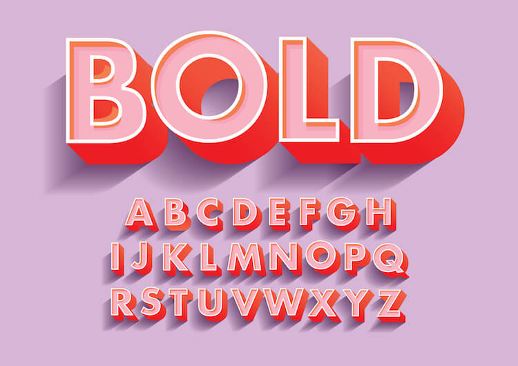
#3 – Extra-Loud Bold Fonts
In 2020 you can expect bold, dramatic, and extra-loud fonts to become increasingly popular with the designers searching for a way to leave a lasting impression.
These are the typographic superheroes that dominate a design as the primary design element. This can really prove valuable in mobile websites. With more people using their smartphone to browse online, bold fonts can make small screens easier to navigate and read. These are a powerful choice when you want to shout or scream your message to your audience.
Caveat loan provider Shane Perry has noticed an increase in time on page after changing his website fonts from regular to bold. He notes “the digital world is so cut-throat. Everyone is looking for the secret to success, the answer may be simpler than you think. After switching our above the fold copy to a more bolded font, we saw time on page increase. This is great for SEO, great for conversions, just great in general. So don’t overlook the small changes if you want big results.”
Caution: Use sparingly!

#4 – Font Pairings
Another way to diversify large text chunks is to single out selective words using different styles or fonts.
93% of online experiences start with a search engine. But with more and more web users are becoming scanners, creating visual pattern interrupts is the most effective way to catch their eye and increase the time they spend on your page. Rather than head back to a blank search engine to start over.
While it was common to combine letter sizes and fonts that were very different into a single area, 2020 will signal a shift towards a look that is harmonious with slight elements of disorder. As 2020 continues, whole paragraphs and sentences will become more unified in composition and size.
By using just a few words to emphasize a point, you can inject a simple and effective message through your typography choice.
#5 – Hand-Lettered Fonts
Individuality has become more important than ever as typography trends change.
With over 2 million blog posts published each day, the content space is beyond saturated. The same competition for eyeballs happens on your business service pages too.
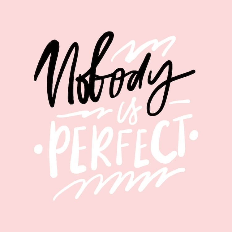
Hand lettering font has appeared as a counter to the generic nature of 99% of content. In the last few years, but especially now as 2020 kicks off, hand-lettering has become a way to convey authenticity and creativity. With many stylistic tones and expressions, hand-lettering can be soft and engaging; or edgy, rustic and bold.
The nuances on offer in hand-lettering provides you with a uniqueness which is easy to enjoy and hard to replicate.

#6 – High Contrast Fonts
High contrast invites more extreme manipulation and customization than other trends in this list.
Rogue experimentation is very common in design, and in 2020 will be more encouraged than ever. Contrast can define hierarchy and demonstrate value through your typography. Got a message that needs to hit home harder than everything else? High contrast typography can suggest value and control how quickly your content is read.
Tools such as Adobe Fonts can help provide you with more options when it comes to:
- Spacing
- Overlaps
- Thins
- Thicks
- Types
- And more.
To fill in some of the dead spaces try experimenting with high contrasts for your next article or landing page, you might be surprised at how powerful your message becomes.
#7 – 3D Fonts
Innovations in technology have opened up new ways for typography to be applied.
These latest design innovations include AR, VR, and photo-realistic styling. As a result, 3-dimensional type offers the opportunity to flow more freely, in ways that interact with the surrounding environment. For example, when using 3D you can distort type using whirls, swirls, bends, and stretch to create an immersive experience.
Typography trends in 2020 have broken away from its screen, page, and grid. As one of the classic pillars when it comes to graphic designs, type was once regarded as a static element. But the type used today has moved towards a more experimental form and space. The impact of augmented reality, and the ability to transform 3D objects that interact with the surrounding environment, is new.
But heading through 2020, this aspect of typography will only become more prominent.
#8 – Emojis, Icons, and Pictograms
Traditional typography is no more.
In its place has grown new and creative ways to communicate. This is especially the case with emojis, icons and pictograms. 🙂😉😀
Not only do these additions make copy look more dynamic. But hypnotherapist trainers Mindset Mastery explain that, by speaking the way millennials and other generations speak, your message is more effective. They add “up to 70% of communication comes from non-verbal cues. In a text heavy page, emojis can add much needed emotional weight and provide valuable context. It’s like being louder than everyone else in the room so your message is heard first.”
Forget classical italics and underlines of various weights to reinforce or express ideas. Gone are simple outlined fonts and colorful blocks. Goodbye to switching between san serif and serif. In 2020, expect emojis, icons, and pictograms to spread across texts for both communication and decorative purposes.
Looking for a little help creating a winning mobile friendly website? Chat to the experienced team at Web Design Just For You for a free quote!

Author Bio:
Luke Kurtz is a freelance writer from Sydney, Australia. Luke is passionate about marketing and SEO and wants to learn as much as he can to one day have a career in writing. Outside of content creation, Luke loves spending time with his cat ‘Mooky’.
Content Disclaimer: This article was authored by the writer/author indicated above in his/her personal capacity. The opinions and views expressed in this article are the author’s own and do not necessarily reflect the view or opinions of Web Design Just for You, or Eileen Forte.
